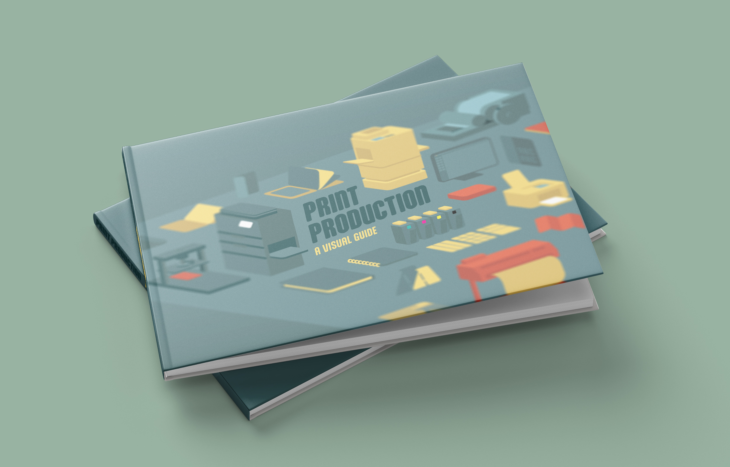
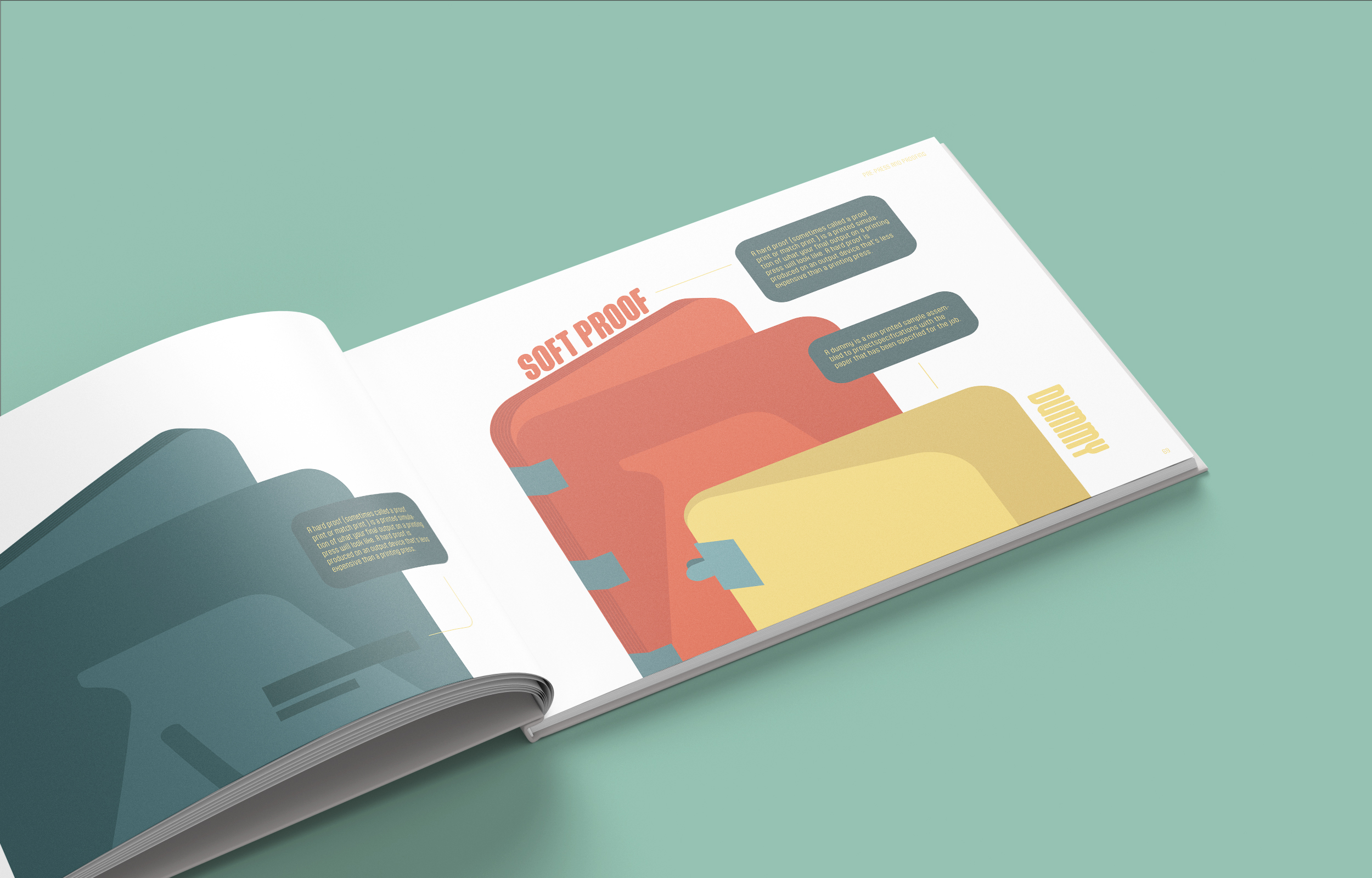
PRINT PRODUCTION: A VISUAL GUIDE was designed using stylistic choses influenced by two contradicting ideas to create a dynamic visual experience, these two ideas were ‘sophistication’ and ‘juvenile’
An isometric 3 dimensional appeal was used as while it is complex in form, it is relatively simple in understanding.
Colors were chosen to resemble an infantile primary palette however saturation was reduced in order to reduce its noise.
The font was also chosen in a similar manner, using soft, round edges while remaining very clean and symmetrical.
Project description
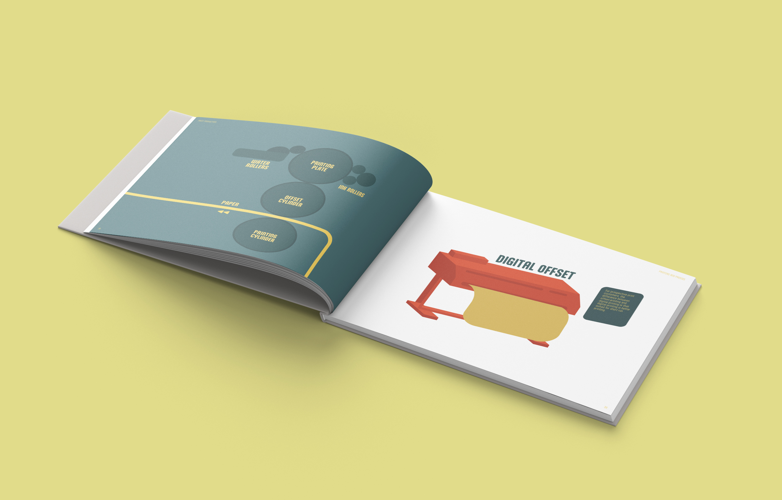
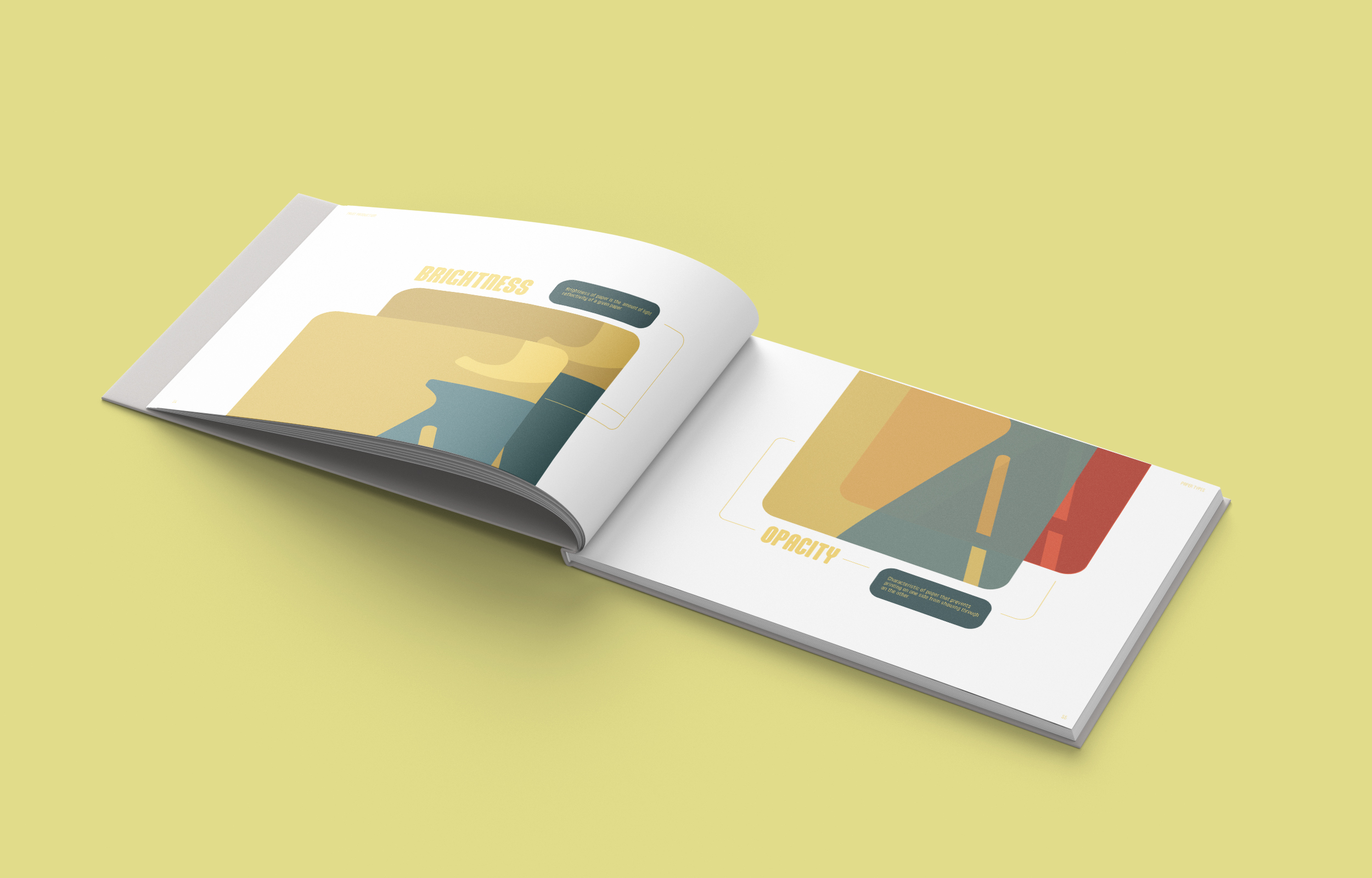
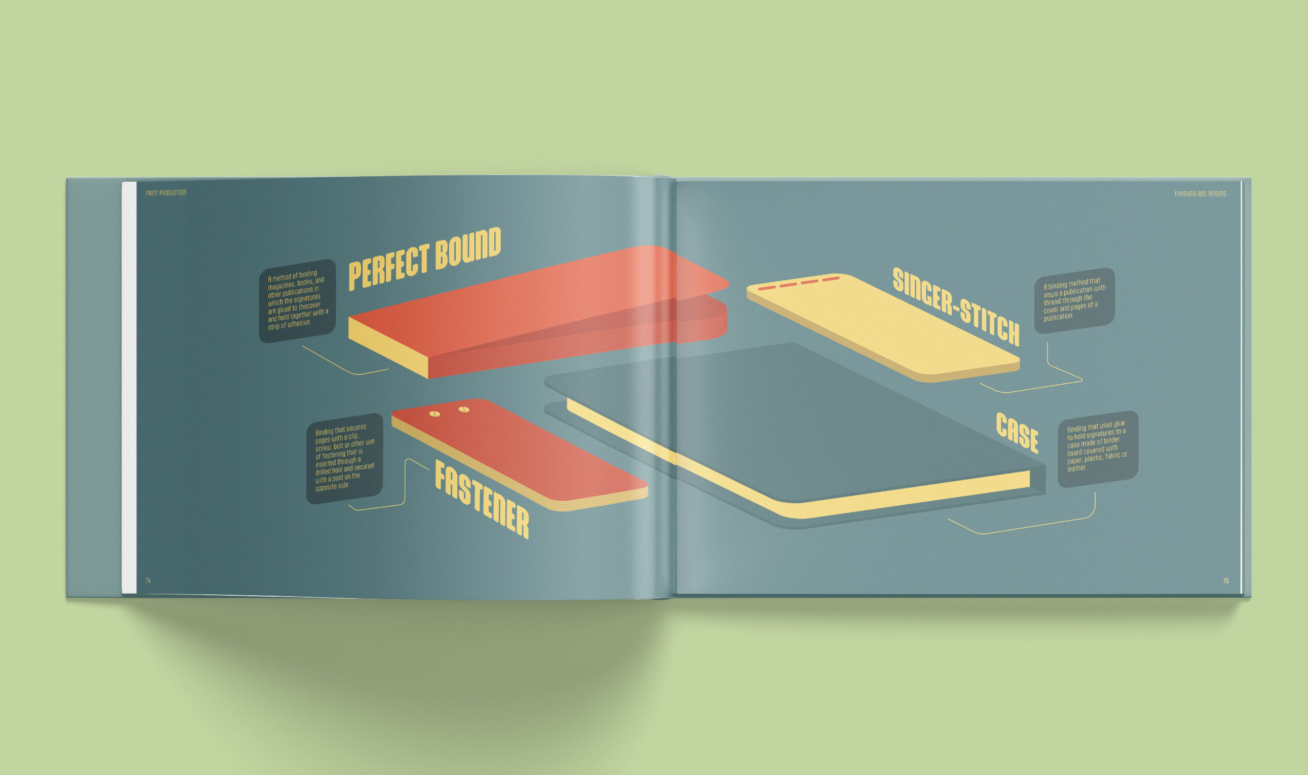
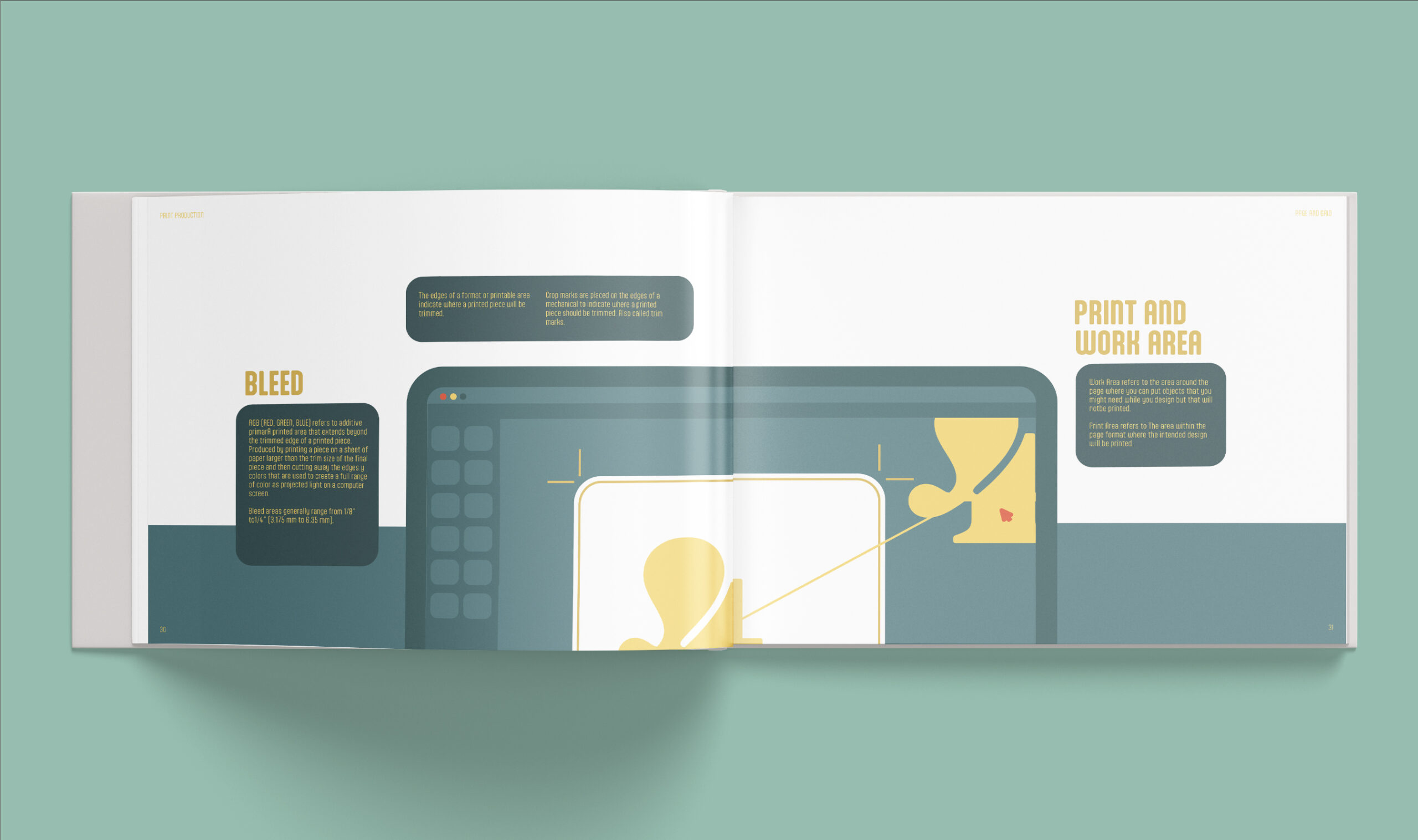
The goal of this project was to develop a guide to everything about print production in a way that was visually interesting and engaging